21 October 2014

Design & Emotion


I recently attended the Design & Emotion conference in Bogota, Colombia. This conference has been in my wish list for some time now and I confirmed why I've always wanted to go. It was a great time full of amazing talks, inspiring projects and cool people. I loved the diversity of the audience in terms of geography, design disciplines and personalities. It was also my first time in Colombia and I loved the country; people in there are so nice, friendly and happy.

HIGHLIGHTS FROM THE CONFERENCE:

Joachim Sauter @ ART+COM - http://www.artcom.de/en/profile/
His talk was so inspiring and cool.  He talked a lot about combining digital and analog experiences in new media design. His approach was very pragmatic in terms of creating basic installations with clever installations that offer a beautiful choreography. He talked a lot about having the viewer doing a lot of the work in enjoying and interacting with the pieces. He showed a piece where people walk on an LED walkway, creating a ripple effect in the screen that transfers to an actual pond underneath. Another piece made for the BMW museum had 700+ steel balls hanging from strings moving up and down, creating this beautiful patterns. He also showed a collaboration with a composer there they integrated music with several of his pieces ( http://www.artcom.de/en/projects/project/detail/symphonie-cinetique-the-poetry-of-motion/ ) His comment about this integration was: "There is nothing more emotional than music" #Genius. What I loved the most was how passionate and poetic he was about describing his work. He even talked about creating creating a flow that connects consciousness and unconsciousness in his work!


=

Cynthia Smith @ Cooper-Hewitt Design for other 90% - http://www.designother90.org/
Her talk was full of great examples of design for social innovation. I really appreciated the stories behind many of this projects in terms of empowering under served communities. She also talked about how it is crucial for this type of projects to have business and marketing plans, otherwise they won't be sustainable and provide the economical support that most people in the world need.


=

Foad Hamidi @ York University - http://www.cse.yorku.ca/~fhamidi/CV.html
He showed a series of projects that made very cool connections between physical and virtual spaces. His approach was very fun and insightful and he is very interested in combining critical thinking with making.... turning it into Critical Making!


=

Leslie Speer @ San Jose State University - http://simplelimb.com/
Stefania Sansoni @ University of Strathclyde - https://pure.strath.ac.uk/
While Leslie and Stefania did not present together, both of them presented about prosthetics and enabling more socially responsible and emotional connections with the users. Their presentations complemented each other quite well and made people think about how to raise the level of apparently utilitarian products.


=

Geke Ludden @ University of Twente - http://home.ctw.utwente.nl/luddengds/
She talked about design for healthy behavior. Her presentation was filled with thought-provoking stats such as how in the last year in the US the fitness industry grew 9% while obesity grew 30%! She also showed cool research projects on enabling healthy behavior. I definitely identified with the idea of designing for behavioral change and the challenges that come with making sure that solutions actually work.


=

Alberto Mantilla @ Curve - http://www.curveid.com/
His work shows a great breadth of industries, from transportation projects for John Deere to bestselling tabletop designs for Alessi to furniture design engineering for Emeco. I really appreciated his down-to-earth approach to this designs and the time that he spent talking about designs that were influenced by his family and that came from the heart.


=

Camilo Ayala @ Universidad de Los Andes - http://exporarqu.uniandes.edu.co/
He teaches Materials and Processes but his approach is so fresh. Instead of focusing on the traditional M&P approach (study the material.... list possible processes.... show examples of applications) he connects with local people that use those processes and has students testing them in real life. So for molding, for example, he'll connect with chocolatiers and will have students making chocolate to the right viscosity so that pieces come out of the mold perfectly. This philosophy is to focus on materials that are available in the person's immediate environment and to uses processes that are locally available. I was very pleased to learn that his presentation won best-in-show.

=

I also presented a paper named "Timelessness in Product Design." I was very excited about this presentation as it showcases a lot of student work from one of my favorite assignments. The audience responded very well to the presentation and I received great questions and feedback throughout the conference. If you're curious about the assignment and student projects, you can read a post I wrote for Autodesk Sustainability Workshop about the first time I offered the assignment: http://sustainabilityworkshop.autodesk.com/blog/design-emotion-and-sustainability
You can also check out more student projects here: http://cias.rit.edu/faculty-staff/154#students-work


=

HIGHLIGHTS FROM BOGOTA:

What an amazing city! I had a great time exploring it and looking at the contrast between the old center, called La Candelaria (my hotel and the conference were both there) and some of the newer parts of the city. I was able to go out for a few runs which always give me a unique perspective on places. What I enjoyed the most is how friendly and positive people are.


I also got to see my dear friend Alejandro Duque. Both of us have been drummers for Bohemia Suburbana and I hadn't seen him since the BS20 tour: http://bohemiasuburbana.com/fotos/. It was great catching up with him and seeing him play at one of his gigs.


I went to Museo de Oro and I loved the collection, the building and the history of the craft. It was great understanding more about the process of gold making and its historical relevance to Colombia.


Food was great, too. I ate empanadas, arepas, great fruit juices, etc. My favorite restaurant was Quinoa and Amaranto (I actually went there a few times). Very traditional, kind of home made food... and all vegetarian!


24 May 2013

Autodesk Gallery

I recently had the chance to visit Autodesk's offices in San Francisco and Portland. This was part of me joining their Expert Elite Program. I'm still not sure what they mean by "expert" but I'm trying to pretend to know cool tricks on their newest software Fusion 360 ... if you're looking for a CAD program that doesn't feel intimidating and allows you to create cool shapes in an easy, fun way, then Fusion is for you. Below is a slideshow of the trip. Part one: San Francisco... always a treat! I got to meet an amazing group of expert users from various disciplines. I still can't believe how knowledgeable and passionate they were about Autodesk products... very cool! And on a side note, I still regret that I don't have pictures from a great dinner that I had at my friend Adam's house. Got to spend a fun evening with his family and friends.

 Hotel Lobby
 
 One of the brainstorming sessions at the Expert Elite summit... very cool to see different thought-flows.
 
 Food truck mall.
 
 View from hotel room... lucky!

As part of the summit we got to go to Autodesk's Gallery. This place is full of cool projects and concepts, all done with Autodesk products. Whether you're into CAD or not, the body of work blows your mind away... There's everything from building models to legos to $50k watches to $2 eyeglasses.

 Gallery lobby... can you say surface continuity?

 Beautiful guitar with composite body and aluminium frame... made entirely out of 3D printed parts.

 Model of Shanghai Tower

 Characther modeled in Mudbox

 Cool auto concept from MB

 Bench designed by Carl Bass, Autodesk's CEO

FDM model (in front) that was sent to Chinese artists to sculpt a large version out of stone.

Lego dinosaur... they build it in CAD to calculate structural stability.

This is how the interior looks like... looks like a city to me.

More auto concepts... this one is based off a biomimicry principle that would let cars be grown just like plants... they would grow out of a single part into the final shape... I know, I don't get it either.

 Stone-carved 3D model.

 3D printed lamp... so cool.

 Aluminium elephant made out of sheet metal.

 Layered modeling technique (using laser cutter instead of 3D printer).

Full-size, 3D printed motorcycle. No, it doesn't work ... and how much would that model cost?

Beautiful airplane frame using biomimicry-based structural modeling.

 Exploration of nature-based patterns.


Part two of the trip was going to the Portland office to meet with the Fusion 360 development team. Autodesk was kind enough to also invite two grad students of our program who have been putting the software to good use this quarter: Bridget Sheehan and Erica Nwankwo.

 Portland awesomeness.

 RIT-ID well represented in Portland!

 One Laptop per Child explained in full detail at the Portland Gallery.
 
 With foam-core mock ups included!

 Great conversation with the Autodesk team.

 Pac-Man tournament at an arcade after the event. Got to meet a lot of great people during this trip.

Awesome pinball machines.

22 August 2012

Different levels of emotion


Last week I replaced both my car and my computer (actually still waiting on my new computer... but that's another story). In the weeks prior to this change I began noticing different levels of emotional attachment with these products.

SIMILAR LEVELS
- I didn't really want to change either one (end of lease for one... replacement cycle at work for the other one). Although I noticed a decline in performance for both and I found myself wondering about their long-term dependability (particularly with the laptop) I still hated the idea that their life cycles had come to an end.
- I knew that I was going to miss both. They had been very dependable products and had helped me in doing a lot of important things.

DIFFERENT LEVELS
- Returning my car made me very sad. I had a hard time letting it go. I realized how much it had done for me and my family: taking us places, helping us moving, carrying my sleeping kids in the back seat, etc. I realized how intense and personal my connection with my car was. The night after I returned the car I actually found myself thinking of it being alone at this random parking lot... wondering how its new owner would be like.

- Retuning my laptop was nowhere near as personal. It was a very dry, emotionless transaction. Although that machine also helped me with so many things (working, planning trips, connecting with the world, watching movies, listening to music, etc.) I didn't have as strong of a connection to it. I realized that in my case the common notion of "I love my Mac" is not about the device itself... it's more about the "Mac experience", meaning the user interface, performance, etc.

This contrast in emotional connection has kept me thinking for days... trying to figure out the core differences between these two products (and other products for that matter). Do you have any similar stories or insights on why a car and a computer create such different connections with their users?

27 October 2011

Recycling means you failed

Recently I heard someone talking about interesting implications of recycling. One of the most common strategies people think of for sustainable products is to make them recyclable. Well, recycling in fact means that the product became obsolete and couldn't keep working as what it was. Recycling means adding additional energy, materials, processes, etc., to turn it into something else. Recycling means giving away all the hard work that was put into the initial life of a product... Recycling means failure.

Are there instances where recycling is actually good and necessary? Of course! but if they are extremely rare. Most disposable products actually come from a disposable, consumerist mentality. They come from cultures that think they have unlimited resources and therefore can afford single-use or short-lifespan products.

The most sustainable products are the ones that keep working as what they are... the ones that last and wear-in. The ones we love because they got passed to us from previous generations and that we look forward to pass on to someone else.

10 September 2011

Taipei adventures

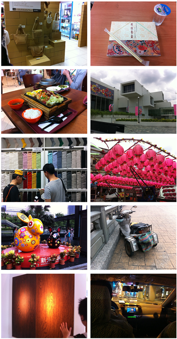
These are some pictures from a recent trip to Taipei. It was so interesting to see a completely different take on design, culture, environment and society. I was particularly impressed by the strong attention to culture and food.

(Captions left/right & up/down)
1- Temples filled with details, craftsmanship, incense scent and tradition
2- Hip nightclub? Nope... Lights at temples' altars
3- Beautiful offerings to the ghosts (soon to be set on fire)
4- No need for plastic lids. Cups are sealed with film :)
5- Practical baby holder for parents on the go... that need to go
6- Yes, she is everywhere
7- Modern architecture filled with meaningful forms and details
8- Such a simple, beautiful bench... so serene (and comfortable, too!)

9- Beautiful cardboard products
10- Ordinary catered lunches that look extraordinary
11- Different take on food-court meals
12- More modern architecture
13- Attention to detail down to the socks
14- Lamps being delivered for the ghost's day celebration
15- Larger-than-life cuteness found everywhere
16- Who said "training wheels" are just for kid's bicycles?
17- Wooden-pattern ceramic tile
18- Taxi driver watching a soap opera

06 July 2011

ahhh... those kids

no explanation needed here... highlights of a core77 discussion board:

Everything Jonathan Ive touches turns to Brushed Aluminum.

Jonny Ive uses Time Machine to roll back history and create new production processes for iPhones that didn't even exist five seconds ago.

Jonny Ive invented the fillet.

On the 7th day, Jonny Ive created iGod.

Jonathan Ive's iPhone turns white in the presence of Orcs.

Jonny Ive has only 17 chromosomes. Coincidently the same number of chromosomes in an Apple.

There is actually a nano-sized clone of Jonny Ive's heart inside every MacBook that makes the power light "beat" when asleep.

Jonny Ive's handwriting is 14 point Helvetica.

Jonny Ive's haircut is CNC machined.

Anyone within a 20 mile radius of Jonny Ive is capable of brilliant Design Thinking.

Jonny Ive sneezed into a tissue and unfolded it to reveal the dimensioned drawings of the first Imac.

Jonny Ive and Steve Jobs can never present a keynote at the same time because their combined reality distortion fields would level Cupertino.

Jonny Ive designed the end of the Infinite Loop

Jonny Ive blew into the headphone port of the Iphone and prototyped the first Ipad.

Jonny Ive only eats food off rectangular plates at a ratio of 1.61 : 1

Jonny Ive makes all his presentations in Garage Band.

Jonathan Ive once had a staring contest with an aluminium billet. Liquid metal was the result.

Jonny Ive can pinch-to-zoom with one finger.

Jonny Ive has never used Command+Z.

Jonny Ive uses his monstrous Apple salary to keep Dieter Rams in cryogenic storage, thawing him out only twice a year, usually on a Wednesday.

Jonny Ive can mill an aluminium block with his fingertips to a tolerance of +/- 0.00000000001".

Jonny Ive would have caught the antenna issue with the iPhone 4 if he knew how to hold anything wrong.

Jonny Ive walked into a round room, and sat in the corner.

Jonny Ive has counted how many licks it takes to get to the center of a toosie pop. Twice.

Jonny Ive is so good at keeping his projects under wraps his wife didn't even know they were having children until Steve Jobs showed the ultrasounds in a Keynote.

Jonny Ive didn't buy a Scott Wilson Tik Tok, because Jonny's Nano hovers 1mm off his wrist without any attachments.

Jonny Ive never has to use the Genius button in iTunes.

Jonny Ive has designed 9 completely unique fasteners that have no external fasteners.

Jonny Ive has never had to repeat a level of Angry Birds on his iPhone.

Jonny Ive listens to bands on iTunes that haven't even formed yet.

Jonny Ive charges his iPhone with solar power, at night.

Every time Jonny Ive eats an apple an angel gets his wings.

unnecessary things

every now and then i see designs for clocks that offer new ways of telling time. many  times these clocks are heavily designed ... you know, over designed... stylized shapes and mechanisms that lead to intriguing objects but poor time pieces... what's wrong with how time is measured now? ... i keep looking at these clocks in search of a valid reason for creating a new way of communicating time... the search never ends well. i always go back to the design of mondaine watches and hope that every time piece was as good. the purpose of mondaine watche's is simply to tell time effectively. no grand ideas of telling time differently... just easier, clearer, better.

the "lean" chair/table  was recently featured in core77. this object is supposed to "challenge the limitations of urban space" ... what a nice challenge, i thought. so the solution is a piece that is unstable by itself and completely dependent on the urban space it tries to challenge. if i need to sit on it, i need two walls to rest it against, leaving me confined to a corner. if i need a table i need to make sure that i add weight to one of the sides so that it doesn't tip over and i also need to watch out for those pointy corners... if i really need to challenge urban space, i don't need to come up with an overcomplicated design in order to succeed. take a simple box, for example... it can serve as a table, a chair, a bookshelf... it doesn't need walls or special surroundings.... and for aesthetics, it can be as clean and beautiful as i want it to be.

i recently bought a pair of shorts. i'm in love with them, mostly because they are so simple. I analyze their components and find no excess... no unnecessary details, decorations or components.  they were very inexpensive, too. i can imagine the design brief: nice shorts under ten dollars. it's so nice to see the work of a designer that didn't turn inexpensive into cheap. just get rid of the unnecessary details that increase need for materials, production and complexity.  in contrast to these clean, simple shorts, i just spent over an hour fixing a pair of pants. i bought them some time ago and even with their lightweight fabric they have become impossible to wear in the summer weather. after a closer inspection i realized the ridiculous amount of unnecessary elements that these pants have.  i cut and trimmed layers and layers of fabric around the pockets, seams, etc. i ended up removing over half a pound of unnecessary fabric. as i was re-sewing the pants, i kept thinking about how could the designer of this pants got away with a design that is wasteful and makes users unhappy.

25 May 2011

fearless

the good thing about designers is that we're fearless. we take on problems like we have nothing to lose and we come up with innovative solutions. not a lot of other disciplines are fearless... most disciplines focus on knowing a lot about something in particular... they need to prove that they are experts in their area so they spend a long time in their area proving that they are experts in it ... they don't feel comfortable jumping to other areas because they don't know them too well. since designers tend to seat in the middle of multiple areas we assume that we know enough in those areas to start jumping from discipline to discipline. that process allows us to make connections that are integrated and unique.

the bad thing about designers is that we're fearless. too many times we end up proposing solutions without really understanding their consequences. we're so excited about making new, innovative connections that we forget to sit down to think about them long enough. at the end of the day, i think the good outweights the bad and i sleep better at night thinking that there are a bunch of fearless designers out there thinking about (among other things) how people can sleep better at night.

16 May 2011

good stories

last night i was watching this documentary about pixar... pretty cool stuff. the highlight of it (at least to me) came when someone said that pixar's success has little to do with computer animation... it's mostly about creating great stories.  yes, they push technology... but they do it with a purpose. they explained that most of the time spent in each project is devoted to developing the story. good design is the same thing.  is not about creating a product... is about creating an experience.... about connecting. i always have a hard time explaining students that they should focus more time on developing a concept rather than on skills... many of them misinterpret this as an opportunity for mediocrity.  a concept is so much more important... it's what sets the good apart from the rest. if someone wants good skills, they can go to coroflot.com and will find thousands of great examples.... if someone is looking for great concepts, for great design stories, then they will have to look deeper.  i'm not saying that skills are not important... they are crucial! pixar wouldn't be a success story without their beautiful output. but focusing only on skills is not enough.  i always have strong reservations about resumes that only focus on skills... and I always think that job descriptions that focus only on skills lead to boring jobs that don't enable positive change in culture and society.  designers that create good stories are the ones worth looking for.